SPSS – Chart Builder
Graphics, charts and tables mostly, help the readers of our paper or the audience of our presentations visualize both the distribution of our data and the relationships between the different variables.
In order to generate graphic elements, we will use the SPSS built-in chart builder.
Data Distribution
The first tutorial will simply help us create a basic bar chart showing the percentual distribution of the data in one variable. In our example, we will show how different ethnic groups are represented in our sample.
And we will adopt the APA style guidelines to format the chart.
This is how the final output will look like:

And here is the video tutorial:
Comparison of Percentage of a Nominal Dichotomous Variable
Independent Samples t-tests help us establish the statistical significance between an independent dichotomous variable and the dependent variable.
Again, a chart shows visually the relationship between both variables and effectively expresses the statistically significant difference.
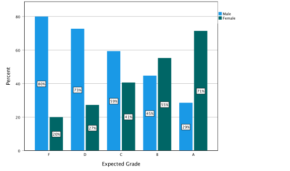
In our example, we will show how gender may impact the expected grade.The final output should look like this:

And in the following video tutorial you can learn how to generate the chart:
Comparison of Percentage of a Nominal Variable With Multiple Categories
We used the ANOVA test, the analysis of variance, to measure the significance of the impact of a nominal independent variable with more than two categories on our dependent variable.
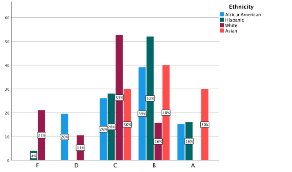
To graphically show this difference, we can use the same type of chart used in the previous tutorial.In this case, we will use as an independent variable the ethnicity of the students who participated in the study.
The dependent variable will be again the expected grade.
Our final chart will look like this:

The tutorial to create the chart:
Comparison of Means
We have been using ANOVAS (analysis of variance) and Independent Samples T-tests to measure the statistically significant impact of a categorical variable on scales (or interval variables).
Both statistical procedures are actually a comparison of means.
In the charts we have learned so far, though, we have used the distribution of the percentages to make clearer the differences.
The reason why we did that is that when using five point Likert scales, the difference in the means, even if significant, does not appear clearly in the charts.
In this tutorial, we are going to generate a chart comparing means.
Data have been slightly manipulated so that the differences are clearly visible.
And as I always say, you have to pick up the type of chart that most effectively highlights the influence of your independent variable.
The final graph should look like this:

In the video tutorial you follow the step to produce the outcome.
Comparison of Data Distribution in Multiple Variables
In the first video tutorial, we learned how to use charts to show the distribution of the data in one variable.
In some cases, you may want to compare the distribution of the data of more than one variable with the same values.
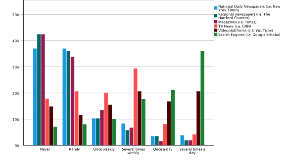
For instance, if we are investigating the sources our audience uses to get information about national or international news, we may be interested in comparing the frequency of use of different media.
How often, our audience reads newspapers and magazines, how often they watch TV news, listen to radio shows, or check their social media for news.
The final bar chart should look like this:

APA Chart Template
Most of the Journals and academic departments in the field of communication adopt the American Psychological Association style guidelines.
And also most of your professors will expect you to follow APA requirements.
SPSS incorporates in its last edition a template that will automatically adapt the layout of our tables and graphics to the APA standard style guidelines.
It is easy to apply. I have introduced it already in some of the videos, but I thought it would be beneficial to have the necessary steps concentrated in a short video to keep it handy at any time.
